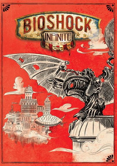
Design #4 is the winner!
Having received 38% of fan votes, this Songbird image will be printed on the reverse side of the inlay for all copies of BioShock Infinite.

Design #4 is the winner!
Having received 38% of fan votes, this Songbird image will be printed on the reverse side of the inlay for all copies of BioShock Infinite.

| Tagged as: | BioShock Infinite, community, poll |
|---|
| BioShock Infinite | 144 |
|---|---|
| BioShock | 50 |
| Ken Levine | 50 |
| community | 27 |
| Irrational Podcasts | 22 |
| Shawn Robertson | 20 |
| Nate Wells | 18 |
kahuna8000 | December 23, 2012 4:41 am
I personally liked the original cover art that was chosen, but I can also understand what people said about it! In my opinion you didn’t have to do the reversible cover but it’s nice that you listen to your fans. Pleased that this was the image chosen as it’s the one I voted for! Still wondering if it’s the one Ken Levine chose?! March 2013 can’t come soon enough!
knives | December 23, 2012 7:52 am
I can’t believe this won. It looks like stencil-drawn fan art. 🙁
#6 was way better….plus it had liz on it (which was what everyone was asking for on the front cover)
elihuaran | December 23, 2012 1:48 pm
Well, this means I’m almost positively getting a physical copy. The only question that remains is if the PC version comes with Steamworks. Because if so, then I’m getting the physical copy. If not, well, to Steam I go!
codex | December 23, 2012 2:20 pm
It wasn’t my favorite. It’s eerily similar to the design that won the shirt contest for PAX a few years back.
Still, congratz to the winner. Obviously a majority like it otherwise it wouldn’t have won 🙂
insectswarm | December 23, 2012 2:46 pm
Where are the purples and blues Irrational talked so much about?
I want to see colors that are in game. The box art with Booker and Elizabeth is too cramped. Its needs to be less “busy”.
Still I will just flip it over to the reversed side.
stevavelli | December 23, 2012 3:06 pm
i think there will be plenty of red in the game too… i don’t talk about blood or anything, but mainly of the vox populi – a worker’s movement without “red” wouldn’t represent the spirit of the early 20th century 🙂
even though there is no liz on the picture, i still like the art style as it reminds me of the early 20th century as well… it has kind of a “circus-poster” style – i like it very much from an art perspective 🙂
zwqase | December 23, 2012 3:35 pm
Sweet! Definitely my favorite. Unique and wonderful.
zombienerd16 | December 23, 2012 4:48 pm
Awesome!!
direwolf | December 23, 2012 7:41 pm
Great, so now I have to choose between a dudebro cover and this ugly thing. Can I just get a copy of the game that doesn’t come with any cover?
Why couldn’t the one with Elizabeth and that mechanical creature win, it was clearly the best one.
tedrandy | December 23, 2012 9:21 pm
Glad this one won. It was by far my favorite. Glad to see that the songbird got a place on the cover.
ryanjameshere | December 23, 2012 9:29 pm
Great! I really liked this cover! Songbird!!!!!
retrobjectivist | December 24, 2012 8:22 am
This cover is amazing, reflects the game’s setting perfectly!
deaddoucher | December 25, 2012 3:56 am
It reminds me of Dr. Seuss…and since that kind of design is already going to be on the song bird packaging from the pre order i’m not all that thrilled that this design won…sad face!! But awesome for everyone who does appreciate it :}
rankya | December 26, 2012 6:50 pm
Love this one, it really stands out from most covers seen today.
6 would’ve been a good choice too, since it’s Elizabeth and Songbird which reminds of previous covers of Big Daddy and Little Sister.
l4v4lamp | December 27, 2012 4:39 am
Was really routing for #6. When will the other covers be available for download so that we can make custom cases?
felixh88 | December 27, 2012 7:55 pm
Wasn’t one of my top faves. It still looks cool but some of the other just had more of a visual punch that drew one in.
sycophanticbs | January 1, 2013 9:11 am
It saddens me to hear inaccurate comments on this post like ‘it resembles a fan-made stencil drawing’. This cover looks great, what I think truly portrays the feel and Idea of Infinite, understandably, there were others which people liked more, but hell, stuff like that really doesn’t help anyone to hear. : (
movielord101 | January 2, 2013 3:48 pm
Hurray! Glad I voted for this design!
hamster | January 3, 2013 12:21 am
i really like this design, goes well with box art designs iv seen for the collectible Columbia statue and sky hook. not to mention the ultimate songbird edition box.
shocker22 | January 3, 2013 8:25 pm
I missed the poll. But I like this. The last design seems like a good fit for a magazine, which it was. Thank you for offering a second option.
maxdewitt | January 4, 2013 5:44 pm
is the best cover !
tothemac | January 6, 2013 3:23 am
I actually liked number 6 the most but this one was my second favorite.
crus | January 16, 2013 2:36 pm
I liked all of these whoever did the artwork great job! This one is cool because it has that sketched look with the red background can’t wait to open the game and see that!!!
november17th | January 20, 2013 2:39 pm
Unique, I’m happy this puppy won.
joshimarston | August 9, 2013 5:12 pm
Beautiful u/w/u